Personal Project #5: Abstraction
Abstract photography is when a photograph is taken with a particular subject in but the main focus of that picture is not the subject, it is something else that also stands out boldly. This type of photography sometimes does not contain a clearly defined pattern. Abstract photography can be changed or photographed with a mixture of colours shapes and patterns that may not even be relevant to each other. It can sometimes leave somebody curious as to what the image is which means it can be interpreted in many different ways.
The formal elements in photographs... |
To the left are some examples of peoples interpretations of 'abstraction' from the tallis arts pinterest page. I picked these images as they all represent a different formal element used in photography. (If you hover over the picture) Many photographers, when they are taking an abstract photograph see beyond the 'subject' and look at something else that people will look at in the picture. When taking abstract photography you have to focus on all of the formal elements and see how they relate with your photograph. |


THE FORMAL ELEMENTS
Questions to think about when taking a photo using one of the formal elements...
Focus: Which areas show strong clarity (sharp) or blurred?
Light: Which parts are light and dark? Are there shadows or patterns? Is the light natural or not?
Line: Are there objects in the picture that create lines? Are they thin or thick lines? How many are there? Are they straight or curvy?
Repetition: Are there any objects or lines that repeat? Does this create a pattern?
Shape: What shapes do you see? Are they bold or hidden?
Space: Is there any depth to the photograph? What creates this? How does perspective change how spacious the image looks?
Texture: How does the picture look as if it would feel if you touched it? Does it remind of another that could feel similar?
Value/Tone: Is there a range of tones? Are they dark or light? Is the pictures dominantly light or dark?

WILLIAM EGGLESTON- is an American photographer born in 1939, He is widely credited with securing recognition for colour photography. He creates many abstract images without being immediately obvious that they are abstract. He does this by using a formal element in his picture as the main subject rather than the object.
Evaluation of the picture
The photo to the left taken by William Eggleston is abstract in many ways. The car is a bold red in comparison to the relatively tonal background which makes your eyes drawn to here first. This brings the questions: Why is some of the car cropped? Is the photographer trying to hide something? The water in the picture is also noticeable. Where has it come from? Why had it been cropped in this way?. The angle that the picture has been taken from is very abstract. It has been taken from above, this makes you notice how much space there is in the photograph (linking in with formal elements). Why is there so much space shown? This could be because space is the main subject of the photo rather than the bolder more common objects: the car, water. Both of these are cropped out in the corner of the picture, which is what makes the photo abstract- a formal element is the main subject of the photograph.
Photoshoot No 1 |
EVALUATION OF PHOTO SHOOT No 1 These photographs represent the formal element- repetition. I aimed to find objects in the school that had something repeating many times. Eg bricks, stairs etc.. Many of the photos included lines so this formal element could come into it. I think all of the photos show something repeating. They are abstract in a way that the main thing you focus on when you see the photograph is the repetition rather than the main subject. |
My favourite image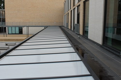
This is my favourite image because I feel there are many things in the photo that show repetition e.g the glass panels on the roof, the lines, the windows etc.. I particularly like the perspective of the picture (where the camera is held) as the lines on the roof look as if they are getting closer together the further along they go but they are all the same space apart.
|
My least favourite image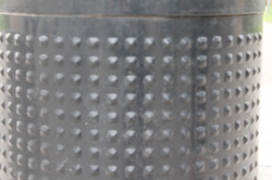
Although this image does show repetition (the dots on the bin) It is a very plain and simple picture and it is obvious that it's of a bin, which takes away the abstract element of it- The main subject of the picture being the formal element. Also the photo is quite out of focus making it unclear and not sharp. It's overall quite dull and it does not represent 'abstraction' well.
|
Formal Element LINE


Evaluation
I think all of the images I have taken show lines in some way, wether they are straight, curvy, thick or thin. I think the abstract element comes into them as each one is focusing strongly on the formal element more than the actual subject. I think to improve I could make sure to look at focus on the camera so my images are more clear and also the size is a slight issue- maybe using a camera rather than mobile photography.
I think all of the images I have taken show lines in some way, wether they are straight, curvy, thick or thin. I think the abstract element comes into them as each one is focusing strongly on the formal element more than the actual subject. I think to improve I could make sure to look at focus on the camera so my images are more clear and also the size is a slight issue- maybe using a camera rather than mobile photography.
POPPLET
Have a scroll through my popplet mind map to see some examples of 'abstraction' included with pictures...
Making photographs using chemicals
Below is the images I made without using a camera or any objects. You use chemicals and experiment with these using photographic paper (or light sensitive paper). It's similar to photograms/ rayographs but we did not use the dark room. There were three types of chemical, 2 that created the colour and one that developed it. You could paint, splatter, dab or spill the colour on to the paper to make an abstract pattern. Once you have put the chemicals on the paper you have to leave it exposed to light (we used natural light) for a few minutes. Then rinse it with water and leave to dry. Below there are 2 images a 'before' image showing how the picture looked after being exposed to light and an after image showing how it looked once it had been rinsed (to clear off any chemical crusts) and left to dry for several days.....
BEFORE AFTER

|

|
Pierre Cordier
Pierre Cordier was born on January 28, 1933 in Brussels, Belgium. He enjoyed photography very much and on November 10th 1956 he invented the chemigram technique. The chemigram combines the physics of painting (varnish, wax, oil) and the chemistry of photography (photosensitive emulsion, developer, fixer) ; without a camera, without an enlarger and in full light.
This is where we got the idea for our chemigrams and playing around with them using photoshop etc...
"With the advent of photography in 1839, painting underwent a radical transformation. Nowadays, the digital process is revolutionising photography. The chemigram, fusion of painting and photography, is most likely the ultimate adventure of gelatin silver bromide." Quote from Pierre Cordier.
Using photoshop with chemigrams
Once I had done my chemigram I wanted to use photoshop to play around with some other images that I had made and combine them to make an abstract photo. Below shows the process of using photoshop...
|
1) Firstly, I started with these two images. One that I had taken in my photo shoot no 1 and the other being the chemigram that I made.

3) Then I changed the fuzziness slider on the picture to find the dark and light parts and select which bits I wanted the other picture to be pasted into. I did this by going to- Select; Colour Range; Fuzziness
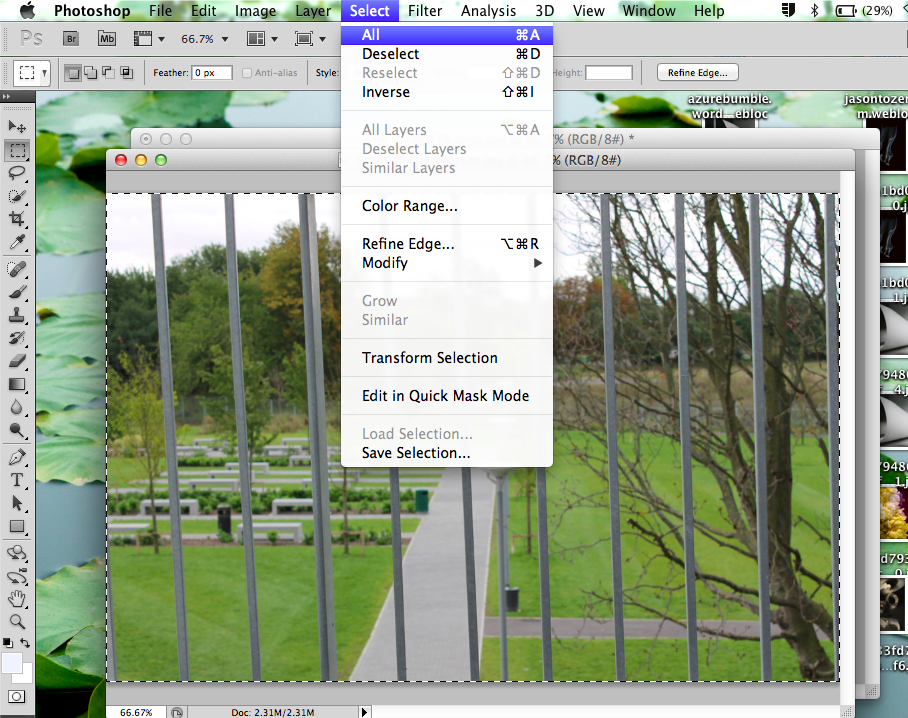
5) Next I went back to the first image and selected the whole picture by doing Select; All
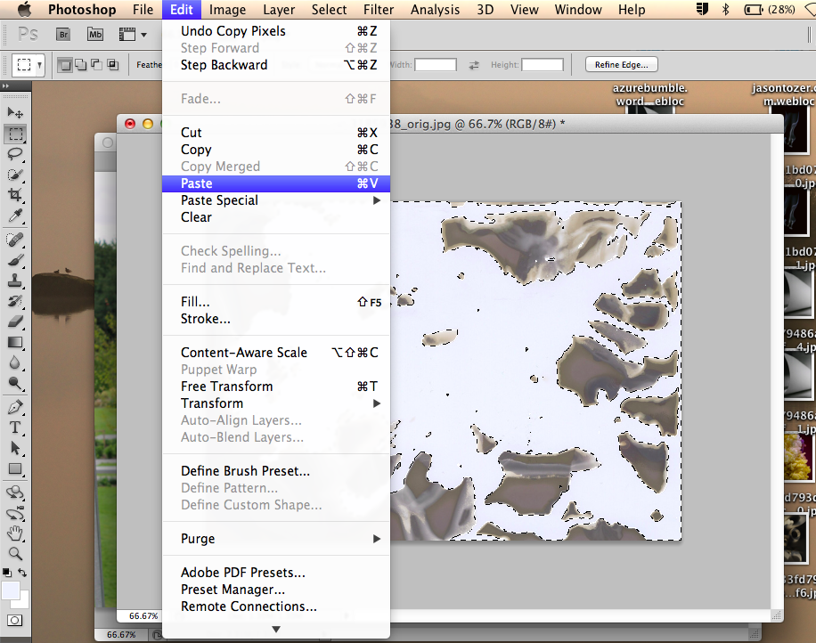
7) Finally, you paste the image into the selected parts of the chemigram by doing Edit; Paste
|

2) Next I rotated the chemigram 90 degrees clockwise so it was the same as the other picture I had taken. I did this by going to- Image; Image Rotation; 90° CW. 
4) After I had changed the fuzziness slider I selected the part of the chemigram I needed for the other picture to be pasted in. I did this by pressing OK once the slider had been changed.

6) Then copy the whole image by doing Edit; Copy

Then the finished project is done and the chemigram and the photo are combined.
|
Photo Shoot no2
Experimenting with textures & shadows..


-I am interested in creating a series of images that are deliberately cropped (or taken) in a certain way and also linking two objects or more in the image with the same colour.
-The reason I am making images like this is because I am researching the photographer William Eggleston and this is similar to how he makes hi photos.
-Over half term I plan to make at least 15 images based on/ similar to William Eggleston and continue my research on him with evaluations.
-The reason I am making images like this is because I am researching the photographer William Eggleston and this is similar to how he makes hi photos.
-Over half term I plan to make at least 15 images based on/ similar to William Eggleston and continue my research on him with evaluations.
More on William Eggleston...


All of these abstract images are by photographer William Eggleston. One pattern that is common in all of his pictures (particularly these) Is that the picture is dominantly one colour or the objects in the picture are of a very similar colour. One thing that is also common in all of these images is that they are never showing the full image, they are cropped in a weird way. I am very influenced by William Eggleston's images and hopefully I plan to create some similar of my own.
PHOTOGRAPHERS
For part of my research for 'abstraction' I have been looking at different photographers and exploring the different techniques they have used in their photos, such as:
-Textures -Patterns -Colours -Silhouettes -Focus
PHOTOGRAPHERS
For part of my research for 'abstraction' I have been looking at different photographers and exploring the different techniques they have used in their photos, such as:
-Textures -Patterns -Colours -Silhouettes -Focus
Keld Helmer Petersen


Keld Helmer- Peterson is a Danish photographer- born in 1920. The images above created by Helmer-Peterson are abstract because the main subject is unclear. He uses two strongly contrasting colours to make the black object stand out, he has done this by increasing the contrast (taking all the grey tones out) to make the image purely black and white.
Ernst Haas


Ernst Haas pioneered colour photography and is also famous for his images of movement using long shutter speeds. He commonly takes pictures of water and the ways in which it moves. He captures it at the right moment and it also looks abstract as the subject: water, does not always look like water (Distorting the image).
Aaron Siskind


Aaron Siskind is interested in surfaces and textures from the environment and urban areas. Particularly walls and trees. He always fills the frame with the detail from the image which makes the images more abstract. -Many of my own images are based on Aaron Siskind's pictures.
MARGATE
As I didn't go on the margate trip, I used some images that were taken them and edited them on photoshop to make them look more abstract (Distorting the image)- This was just to experiment with different shapes and link them to abstraction:

|

|

|

|
My images
Pictures based on sutcliffe park trip. When taking these pictures I was focusing on colours, textures and reflections.


When taking these images I was thinking about reflections, colours and textures which I thought were most common in water, trees and leaves: the environment.
Aaron Siskind Inspired Images
Many of my images were based on Aaron Siskind's as he looks at surfaces and textures. Below I have edited pictures together that I feel best represent textures, mainly looking at tree trunks and have edited them on photoshop to look similar to Siskind's and to look abstract:
I created these images/changed them by changing the shape to square, making the image black and white and turning the contrast up to make the black and white colours clearer and more defined. Then I added a black border to make the pictures look even more abstract, I did this using photoshop.


REFLECTIONS
From the images I took myself, I picked out 4 that I thought most represented 'Reflections' and edited them using photoshop to bring out the reflection more and make it look abstract, Then used it in on of my final pieces below:
FINAL PIECE


|
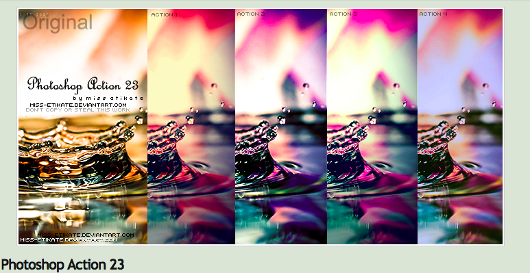
I edited the pictures above (of reflections) using the photoshop action to the left 'photoshop action 23'. I got this from Deviant Art, I chose this effect as it is made for water so it brings out the reflections. It also brings in some nice blue and purple colours to the image. |
FINAL PIECES
|
Evaluation
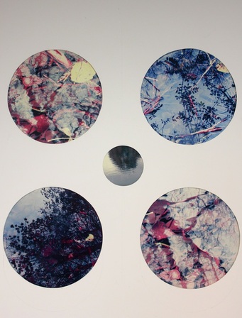
When I made my margate images into circles it gave me the idea to use circles for my final piece. This was because circles are pure geometric forms meaning you don't know which way round they go, therefore making the images more abstract. So with a large piece of card I cut out 4 big circles and a smaller one in the middle. From my own images I thought I would pick out which images best represented 'reflection' and use this as my theme. I edited the pictures using photoshop to make the colours look more vibrant and make the reflections clearer. Poem used in final piece below Here is a place of disaffection Time before and time after In a dim light: neither daylight Investing form with lucid stillness Turning shadow into transient beauty Wtih slow rotation suggesting permanence Nor darkness to purify the soul Emptying the sensual with deprivation Cleansing affection from the temporal. Neither plentitude nor vacancy. |

|
Evaluation
I went out and took some images that I felt best represented the formal elements 'tone' and 'light'. I liked the idea of using branches and leaves from trees against the sky as it really brings out their silhouette and the white fluffy clouds in the background contrast well with the dark trees. I also added an extract at the bottom from the poem: The four quartets by T.S Eliot. I thought this linked very well as it sounds like it's talking about trees. It uses the words: stillness, beauty and light which really represent these photos. (Poem above) To improve I feel I could have improved the quality of the photographs as I took them on an Ipod, so I think a DSLR would have been more effective. |


